11. UCLA

in college, like in the pros powder blue uniforms = fucking awesome.
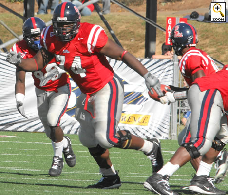
12. Ole' Miss

despite being a total joke of a football team in the SEC, Ole' Miss sure looks fucking good in those bright red jerseys and dark blue helmets. we'll gloss over the fact that they still wave the rebel flag in Oxford on game day and instead focus in on the fact that they have the hottest co-eds in the conference
13. BYU

those crafty mormons sure know how to design a killer football uniform. for a few years BYU had these really awful ones that only the sick minds at Nike could have come up with, thankfully an outcry from the fanbase caused the team to go back to their more traditional blue and white unis. i wish the blue was a little brighter like the Steve Young/Robbie Bosco/Ty Detmer days, but the current uniform is still crisp and clean and cool looking. plus i love their logo.
14. Ohio State

great colors, simple design, winning tradition, looks good on TV. go Buckeyes. Florida owns your ass, but at least you have better uniforms.
15. LSU

despite the fact that they have maybe one of the ugliest color combinations ever, they somehow pull it off. like the Dallas Cowboys, LSU usually only wears white...and it's a a good look, those awful purple jerseys would surely knock them out of the top 25, but the white with gold and purple trim just look pretty badass.
16. North Carolina

baby blue doesn't just look good on the basketball court. the Tarheels might not be a very good football team currently but needless to say while getting their asses kicked on Saturdays they get it done in style.
17. Arizona State

ugly colors, but they sorta work, great logo on the helmet. sorta reminds me of Raising Arizona for some reason.
18. Colorado

the black and gold colors are pretty killer and they have one of the top 5 logos in all of cologe football. it's sort of an intimidating look...if they weren't currently sucking it up in the big 12. i think Dan Hawkins will eventually undo all the the damage in Boulder and get this once proud program back on it's feet.
19. Oklahoma

classic look, good colors. basically the same uniform as Alabama except they have a logo. when Nebraska plays Oklahoma it might be one of the best looking games in all of college football...i just wish they'd both go back to running the option.
20. Army and Navy

i kinda feel like the Army and Navy uniforms are interchangeable and when they play each other on the field i feel like i am watching a highschool football game. so simple it almost hurts, but classic as hell.
21. Air Force

where Army and Navy are the absolute mark of a simple classic look, the Air Force goes the totally other direction with their wacky ass bright blue unis. they sort of look like a CFL or Arena League team...but in a good way. plus i love the Lightning Bolt.
22. Purdue

not much to say. good color scheme. nice logo. road and home jereseys are both great.
23. SMU

it's actually their classic uniforms from the 70s and 80s that i love the most, but even their post-death penalty unis are pretty sweet. they kind look like a lost CFL or USFL team.
24. Texas A&M

classic, good colors, hasn't changed, soooooooooo fucking Big 12 it hurts.
25. Florida

i used to fucking hate Florida's uniforms...but they work. i prefer the white helmets, but whatever. winning national titles helps make an ugly uniform more acceptable i guess.


No comments:
Post a Comment