Showing posts with label uniforms. Show all posts

Sunday, November 1, 2009

A Look Back On the Ugliest Day In SEC Uniform History. Never Forget.

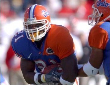
this year for Halloween both Georgia and Tennessee decided to play tricks on my optic centers with their special brands of alternate-uniforms. and i can safely say that other than that time Florida wore those jerseys with the weird ass sleeves (you remember the ONES!) this might've been the ugliest uniform day in league history. i just can't decide whose is worse.

1st up we have the University of Trying To Pull Things Out've Our Ass to Motivate Our Lousy Football Team Who Is Slowly But Surely Descending Into Irrelevance...also known of Georgia.

you know how the Dawgs love to turn shit from Red to Black and think it makes everything magic. well how'd that work out for you guys the last couple of times? as much as i loathed the Black Out jersey (and not just cuz of the beatdown Auburn got) this takes that to a whole new level of suck. the Dawgs looked like a cross between an inner-city high school squad and a USFL team from the 80s.

kinda like the Houston Gamblers except not cool or intimidating at all.

why Georgia (who i have always thought of as having one of the top 10 coolest uniforms in all of college football) would wanna fuck with their look just to wear some silly black outfits is beyond me. at least with the black out Jerseys it's something to sell to the fans. what the fuck are you gonna do with those stupid pants and helmets? i have a suggestion...burn them, along with all your black out jerseys too.

Dawgs are FAIL.

as much as i hate whenever the Dawgs try to change things up at least they actually HAVE black in their color scheme. Tennessee on the other hand just pulled a black out from nowhere so that they could change their teams normal push-pop look into giant fucking candy corns!

what an unholy fucking eyesore we have here.

just what every fan wants...the team to look like a bowl of candy.

i mean, yeah it was Halloween, but that doesn't mean you HAVE to wear a costume on the football field. ugghhhh.

anyways. i hate them both...but can't really pick a WORST among the two. my lean is with the Vols just cuz they look so fucking stupid anyways and then ended up making themselves look even worse. BUT Georgia did get their asses kicked and played just like the Division II team that they looked like. so it still could go either way for me.

and Auburn, don't even THINK about wearing orange jerseys. NEVER EVER NEVER EVER NEVER!!!!

Monday, October 19, 2009

Best and Worst NFL Throwback Uniforms


so you probably already know by now that it's the 50th anniversary of the old AFL and all the original teams are wearing throwback replicas of their original counterparts. some are awesome (Chargers, Bills, Raiders, Oilers) and others make me wish i were blind (Broncos). anyway it got me thinking about my favorite and least favorite throwback uniforms in all of the NFL and so i made a useless list of each.


The BEST (aka Do)

1. San Diego Chargers

nobody can touch the powder blue. why these aren't the Chargers everygame uniforms i will never understand. if you watch a Chargers game EVERYONE in the stands is wearing these. hell these aren't just the best throwbacks...they are the best NFL uniforms ever...period.

2. Buffalo Bills

as much as i love the Chargers, i'll admit that Buffalo is pretty damn close to being just as good. there's just something about THAT color blue and those white helmets and that red bison. it just looks fucking crisp and stylish and super retro. i don't know, they're just fucking rad. this is another team that should just switch back to their classic design cuz what they wear now sucks.

3. Detriot Lions

yes, they suck at all things playing football related, but damn those throwbacks are pretty sweet. i love the solid uniforms without many stripes and the no logo look. i've always thought Detriot had some of the best colors in the NFL and so just seeing the Silver and Blue stand alone without anything else just makes it pop for me. every thanksgiving when they rock these i always say, "well at least Detriot has better uniforms."

4. Tennessee Titans (Houston Oilers)

if you can't tell by now, i loves me some blue uniforms...especially powder/baby blue. those old Oilers unis are the powder-bluest. the Oilers are a team who i ALWAYS loved their look and when they unvailed the Titans design i just hung my head and wanted to cry. whatever, having sweet throwbacks won't make anyone forget how fucking bad they are this season.

5. New England Patriots

okay, i'll admit that the old school Pats unis are kinda wussy lookin' and mostly they just remind me of being a little kid and watching the Bears destroy them in the Super Bowl...but i HATE their current uniforms and would much rather see them go back to rockin' Patriot Pat instead.

bonus pick:

6. Atlanta Falcons

file this under: shameless homerism. but i FUCKING LOVE those Falcons original throwbacks. the black jersey with the red helmet and the gold and black stripe that gives a nod to Georgia Tech and UGA. when they busted these out for the first time this year i got really stoked and even thought about buying a jersey...and then i remembered that people who wear NFL jerseys are usually douchebags and so i didn't.

The WORST (aka Don't)

1. Philadelphia Eagles

Where Powder/Baby Blue goes horribly wrong...when it is combined with BRIGHT FUCKING YELLOW. worst uniforms in any sport...EVER. to be fair: these technically ARE NOT Eagles uniforms and are instead the Frankford Yellow Jackets. but the Eagles still thought it was a good idea to take the field in these and try to sell them to the public.

2. Denver Broncos

boring brown and yellow make them look like giant rotten bananas. and what the fuck is up with those fucking socks?! another reason why Cutler wanted out of town.

3. New York Jets (New York Titans)

like the previous two teams you can understand why they had a complete color scheme overhall. i don't even know what you call this other than boring.

4. The Tampa Bay Buccaneers

NO ONE WANTS TO SEE THE GAY PIRATE EVER AGAIN! worst NFL uniforms of my lifetime.

5. Pittsburg Steelers

it's funny how much just changing the color of the helmets and pants totally ruins what is one of the NFL's best uniforms ever. i don't know, yellow just sucks when it's on your head, dude. hate it, hate it, hate it.

Wednesday, July 8, 2009

File This Under: AUful Ideas (wow, what a bad headline)

Jerry beat me to the punch...but i still gotta get my 2 cents in.


via Auburntron who went all crazy with NCAA 2010's uniform builder and created these would-be alternate unis fo our beloved Tigers. seriously, I HATE ALTERNATE uniforms more than i hated late 90s Faux-Grunge (Creed, Bush, STP, etc...) and i hated that bullshit a lot. still it's a good idea of what life would be like if NIKE ran our team like they do with Oregon. speaking of which....

WHY?

Tuesday, June 2, 2009

Oregon, you've been unseated!

looks like i need to think about reshuffling those Worst Uniforms In College Football rankings because Boise State has just stepped up to the plate BIG TIME and smashed it into the upper deck.


when Boise State plays Oregon this season on September 5th at Boise on the Smurf Turf it might be wise if you avoided watching it all together for fear that your eyeballs might rupture.

i didn't think it could be done, but the Broncos have officially out uglied the Ducks.

Friday, May 22, 2009

Worst Uniforms In College Football (1-13)

first of all i limited this list to DIA teams or else Florida A&M, Delaware, Grambling State, and Rhode Island would all have a place on this list. for a more positive take on college football uniforms here's my top 25 best.

OK now let's start the list of shame.

1. University Of Oregon


naming Oregon #1 is too easy, too lazy, uninspired. it's like calling Nevermind the most important album of the 90s....like duh. but it almost goes without saying when you discuss the WORST uniforms in all of sports (not just college football) that the Oregon Ducks are usually one of if not the first teams that people will mention. so much has been written about the Ducks Unis that it just seems like overkill to even bring them up. first off they don't have 1 singular home or road uniform and instead feature a cast of thousands of possibilities that would be maddening to me if i was a fan. they don't really wear football uniforms so much as they are merely a testing ground for every ridiculous design idea that anyone at Nike can come up with. "hey, do you think it would be cool if we had these little reflector looking things on the shoulders?" (pause) "Yeah that sound like a great idea. let's do it in 5 different colors and start production."

so many different ways to look retarded...so little time.

and then of course there are the emo wings...

extra bonus suck points go to Oregon for changing their uniforms at halftime during the USC game (obviously Phil Knight made this call because he knew the Ducks would be on national tv) and then getting beaten by the Trojans.

2. South Florida

oh the Bulls. honestly i'm starting to think that they might be more deserving of the top spot than Oregon if only because they have just one uniform that they decided to go with and it is officially the ugliest thing possible. they look like they were designed by some methhead with a graphics design degree that he got online. it almost looks like they somehow got hold of some of Miami's old uniforms from the 60s and slapped a new logo on the helmet. truly awful awful shit from a state that has always turned out teams with ugly uniforms in all sports (with the lone exception being Florida State).

3. The Clemson Purple Attack

honestly it's not like their Orange unis are that much better, but when Clemson decides to go with that all purple look...well it sorta reminds me of Barney and Grimace's illegitimate lovechild.

4. California

oh Golden Bears...what have you done? not that your previous look was much better...but the Mustard jersey is just not a good look for anyone. and what's up with that stripe down the center of the helmet that isn't really a full strip and gives off the impression of a receding hairline? and then to top it off the little bear claw marks on the pants...yeah those are fucking lame.


5. Wyoming

it's bad enough when your team sucks at football...but then you also take the field looking like that. Brown tops with yellow bottoms and a white helmet. UGH. your the cowboys...just rip off Dallas. when i look at this the only thing i can think of is a rotten banana.

6. Oregon State

its a good thing you guys are good at upsetting USC because you sure as shit don't know how to pick a uniform. maybe it's the negative influence from your state rival. maybe it's the Nike affiliation. maybe it's just hard for a team nicknamed the Beavers not to look ridiculous. whenever i see you guys on TV i can only think of one thing...Halloween.

7. Iowa State

it's hard to imagine why Gene Chizik wouldn't have wanted to stick around when his team was taking the field in these babies. Iowa State's old uniforms were pretty fucking terrible...they had a cyclone on the helmet and a bird or something...i don't even know, whatever...it was obvious that they needed to change it up, but going with these Southern Cal knockoffs didn't earn them any points with anyone.

8. East Carolina

a real pirate should not be wearing purple. ever. East Carolina's uniforms remind me of something that a highschool football team would wear. it's just so generic and awful and just looking at it makes me feel bad for their fans.

9. Tennessee

why The Vols decided push-pop orange was the way to go i will never understand. i know it has something to do with their uniforms looking weird on television when the networks first started broadcasting college football games in color and the neon made it look like regular orange on people's sets...but i'm pretty sure that problem has been fixed by now. and yet Tennessee still look like push-pops.

10. Boise State

as a college football fan there is nothing more damaging to your retinas than trying to watch a Boise State home game as the Broncos run wild on their blue turf nightmare. they sort of disappear and blend into the background and you start to feel like you are 16 years old again and you just dropped acid for the first time and you're trying to listen to Darkside Of The Moon in your bedroom because that's what you are supposed to do when you are 16 and taking acid, but your dad comes in and starts asking you questions about school and you get all freaked out and you just want him to go away and he keeps talking to you and then his face starts melting like that scene in Raiders of the Lost Ark and you are losing your shit.....huh...what's going on? why am i watching these weird little Smurfs play football? fuck it, i'm changing the channel.

11. West Virginia (the all Mustard mindfuck)

even a football god like Pat White couldn't make these atrocities look respectable. note to teams with any amount of yellow in their uniforms: NEVER GO WITH THE ALL MUSTARD JERSEY/PANT COMBO EVER FOR ANY REASON.

12. Virginia Tech

i mean the Hokies were fucked for life with that color combination...but then last season they decided to change it up and give us those weird orange sleeves that go down the side of their jersey. seriously do the people who work in the Nike design department have running bets with one another to see who can come up with the stupidest/ugliest fucking uniform possible and then try and see if the team they designed it for will actually wear it? this has to be going on...it's the only way you can explain half of this shit.

13. The Entire MAC

i don't know if there is a football conference doing a better/worse job of sending out lousy college football uniforms than the fucking MAC. i mean seriously of the 13 teams in that league not one of them has a good looking uniform. they range from the bland (Temple, Ohio, Miami, Buffalo) to the truly ghastly (Toledo, Bowling Green, Kent State, Akron) and the closest thing to a uniform that isn't terrible would be Ball State and all it really looks like is a bad imitation of the Arizona Cardinals...and who wants that? the MAC is like if the Cleveland Browns and the Baltimore Ravens fucked and had a bunch of retarded looking crack babies who all started little football teams. things are bad enough for the people of the Rust Belt...they could at least get some halfway descent college football unis to look at.

if they played football in the former Soviet Bloc countries these would be the ugly things that i'd imagine their teams would wear.

Worst Uniforms In College Football (14-25)

14. Army Camo

there are so many things wrong with this that i can't even formulate my thoughts into words. it's like if GI Joe had a football team. our armed forces deserve better.

15. Georgia Tech

what is up with the Yellow Jackets and ugly unis? they seem to change their uniforms every single season and with each year they grow uglier and uglier. last season they decided on this butter colored disaster. you're the yellow jackets...keep it simple. go black jersey with yellow numbers and white pants with yellow and black stripes...then use the classic white helmet with the yellow GT.

16. The Black Out Jersey (Utah, Middle Tennessee State, UGA, etc...)

as an Auburn fan it should come as no surprise that i hate a motherfucking blackout jersey...but it's not just because i hated watching Georgia Soulja Boy all over Auburn's ass in them, i also think they make teams look like they are in highschool. it's a lame gimmick that's all about selling another jersey to the fans. alternate uniforms in general are something i could do without, the blackout jersey is just another part of that. even worse are the teams who don't even have black as a primary part of their team colors who decide a blackout is the way to go (Middle Tennessee State and Utah being the worst offenders).

17. San Jose State

for this entire decade the Spartans uniforms have been an ever evolving parade of suck. but really, what the hell are you gonna do with that color combination anyways? you know when you are watching a football movie with fake teams and they always have retarded looking uniforms that no team would ever really wear? yeah well that's San Jose State in a nutshell.

18. Northwestern

purple strikes again. monochromatic purple unis = teh suck. only pimp ass looking old black men on their way to church can or Chuck Bass can rock an all purple outfit...Northwestern football is neither of those things.

19. UAB

when i see UAB's uniforms the first thing that jumps into my mind is early 90s expansion team designs or the old World League. plus who can take that dragon seriously? not even the most ironic hipster in the world could rock a UAB t-shirt and feel good about themselves.

20. Texas Tech

i honestly feel like the Red Raiders uniforms tell the story of a program who is built to develop QBs for the Arena League or the CFL.

21. Tulsa

i can't really put my finger on exactly what i hate about Tulsa's uniforms...maybe it's that they are called the Golden Hurricanes and that hurricanes are neither golden nor do they take place in the state of Oklahoma. and that FONT...will you look at that fucking font! what is that?!

22. Syracuse (Orange Crush)

of the many crimes that Greg Robinson committed against the once proud Syracuse football program, the one that is probably most underrated and yet no less horrifying was allowing the Orangemen to take the field in these Day-Glo Abortions.

23. Hawaii

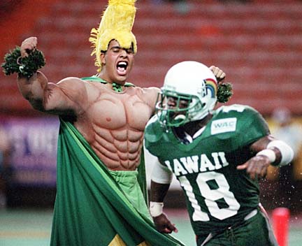
seriously there must be some rule that says if you're offense is based on throwing the ball 90% of the time then you have to wear mostly black uniforms. i liked Hawaii's uniforms better when they had big rainbows on the sides of their helmets.

24. San Diego State

i've run out of witty shit to say. these just fucking suck. plain and simple. these uniforms are ugly and they look stupid and just thrown together. again it's another team who makes me think High School team when i see them on TV.

25. Minnesota

for a team that's basically had the same uniform for decades you'd think they would have some classic icon design that they wouldn't even think of changing...and yet the Gophers take the field every year decked out in these things and they are totally ok with it. mediocrity reigns supreme. no wonder the Walshes moved to Beverly Hills.

Monday, May 11, 2009

Top 5 Favorite MLB Unis Of All Time

excluding the New York Yankees who easily have the greatest uniform in MLB history (it sucks, but it's true) these are my own personal favorite uniforms in baseball history.

1. KC ROYALS Powder Blues


2. ATLANTA BRAVES 72-80


3. Montreal Expos Original Unis


4. Milwaukee Brewers 1978-1993


5. Chicago White Sox sometime in the 90s-current